Natural Paint Colours
Our sustainable paint colour ranges.
Graphenstone Paints & Earthborn
All great, just different colour palettes.
I have used pretty much all of them in my own home!
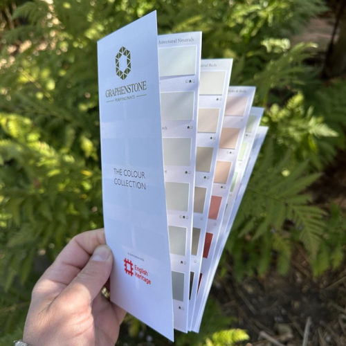
Graphenstone
This colour range is available in the following:
Graphenstone Grafclean
Matt interior wall emulsion
Graphenstone Grafclean Eggshell
Interior wood and wall paint
Graphenstone GCS Interior
Lime based interior wall paint
Graphenstone GCS Exterior
Lime based exterior wall paint
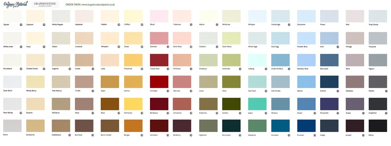
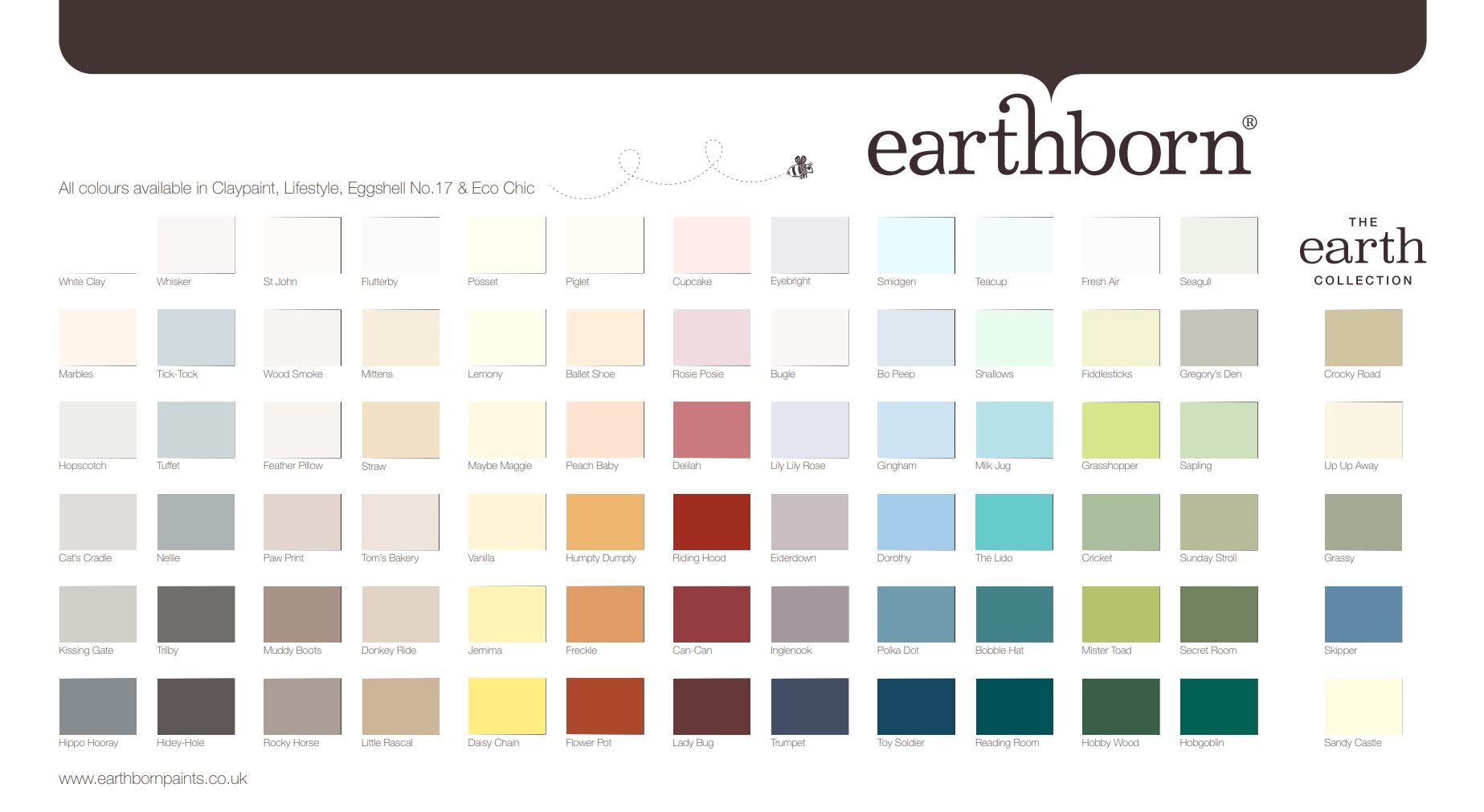
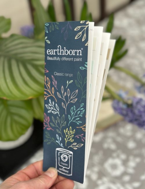
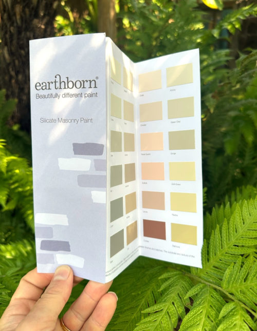
Earthborn Paints
This colour range is available in the following:
Earthborn – Clay Paint
Interior matt clay based wall paint
Earthborn – Eggshell No. 17
Interior eggshell wood paint
Earthborn Lifestyle
Hybrid Interior Wall Paint
So what’s the difference between Graphenstone and Earthborn?
The are both exceptionally great manufacturers of eco and sustainable paint, the two leading examples, and some of the few brands that I will stock due to their unequalled certification and eco credentials. In a sea of greenwashing, it’s hard for the consumer to see the wood for the trees. You can’t go wrong with either.
2025 Update! We just added the new Earthborn range of colours! Have a look at their in depth paint colour guide here, or order an Earthborn colour chart, or check out their top selling Earthborn Clay Paint.
COLOUR WARNING
Don’t order directly from online colour chart.
All colours are mixed to order and cannot be returned, please buy a tester first. Only whites and clear can be returned.
Colours vary dramatically from monitor to screen.
Learn more about how to choose wall paint colours.
The Most Popular Interior Wall colours for Your Home
Harnessing the Power of colour: A Guide to Interior Wall Paint Choices
Selecting the perfect interior wall paint colour can be a daunting task, given the seemingly endless array of options available. However, understanding the characteristics and effects of different colours can help you make an informed decision that not only complements your home’s design but also enhances its overall ambiance. In this article, we will delve into the world of colour, exploring various hues and offering suggestions on how to incorporate them into your home’s interior.
Blues – Choosing blue toned interior wall paints
Blue is a versatile and popular choice for interior walls, known for its calming and serene properties. Ranging from deep navy to pale sky blue, this colour family can evoke feelings of tranquillity and stability. Use lighter shades in bedrooms and bathrooms for a soothing atmosphere, while darker blues can add depth and sophistication to living rooms and dining spaces.
Read more: The Allure of Blue Interior Wall Paints: A Comprehensive Guide to a Timeless Classic
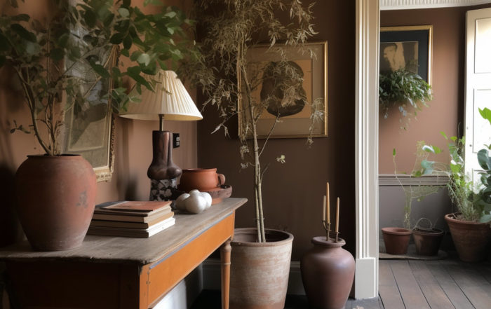
Browns – Choosing brown toned interior wall paints
Brown is a warm and earthy colour that can create a cosy and inviting atmosphere in your home. Brown is a complicated colour to mix to, but when you get it right allows tones from rich chocolate to soft caramel. Brown shades can be used to add warmth and depth to any space. Consider using brown as a backdrop for an eclectic mix of textures and patterns, or pair it with creams and beiges for a subtle, elegant look.
Read more: Embracing Earthy Hues: The Enduring Appeal of Brown Wall Paints
Greens – Choosing green toned interior wall paints
Green is often associated with nature and renewal, making it an ideal choice for creating a fresh and vibrant atmosphere in your home. From deep emerald to soft sage, green shades can be used to add energy and life to a room. Lighter greens work well in kitchens and bathrooms, while darker hues can create a dramatic focal point in living areas and bedrooms.
Greys – Choosing grey toned interior wall paints
Grey has become increasingly popular for interior walls, thanks to its contemporary appeal and ability to work with a variety of design styles. Light grey shades can help to create a calm and sophisticated ambiance, while darker tones can add drama and depth. Consider pairing grey walls with bold accent colours or metallic accents for a chic and modern look.
Read more: The Timeless Charm of Grey Interior Wall Paints: A Comprehensive Guide
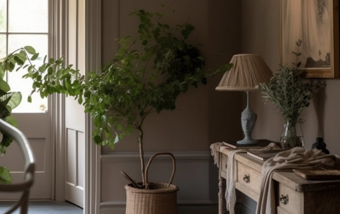
Neutrals – Choosing neutral toned interior wall paints
Neutral colours, such as beige, cream, and off-white, are classic choices for interior walls, offering a timeless and versatile backdrop for any design style. These colours can help to create a sense of space and openness, making them ideal for smaller rooms or areas with limited natural light. Use neutrals as a base for layering with bolder colours and patterns, or keep things simple for a minimalist aesthetic.
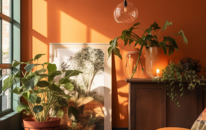
Oranges – Choosing orange toned interior wall paints
Orange shades, from vibrant tangerine to muted terracotta, can bring warmth and energy to a room. Often associated with creativity and enthusiasm, orange can be an excellent choice for home offices or playrooms. Pair with neutral colours to balance the intensity, or use in small doses as an accent colour.
Read more: Energising Spaces: Embracing Orange Wall Paints for a Bold and Invigorating Home
Pinks – Choosing pink toned interior wall paints
Pink is a versatile colour that can evoke feelings of warmth, romance, and playfulness. Soft blush tones can add a touch of sophistication to a bedroom or living space, while bolder pinks can create a fun and lively atmosphere in children’s rooms and entertaining areas. Pair with neutral colours for a balanced look, or experiment with contrasting hues for a bold and daring aesthetic.
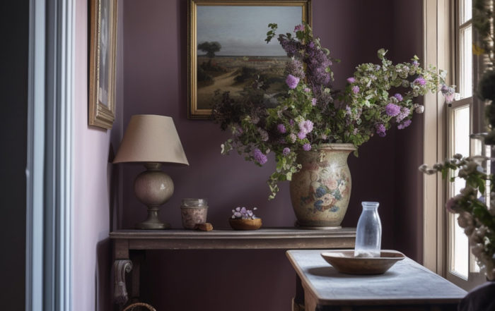
Purples – Choosing purple toned interior wall paints
Purple, a colour often associated with luxury and royalty, can bring a sense of opulence and depth to your home. From deep plum to soft lavender, purple shades can create a dramatic and luxurious ambiance in bedrooms and living areas. Pair with metallic accents and rich fabrics for an indulgent feel, or keep things fresh and modern by combining with crisp white or cool grey.
Read more: The Power of Purple: A Comprehensive Guide to Purple Wall Paints in Your Home
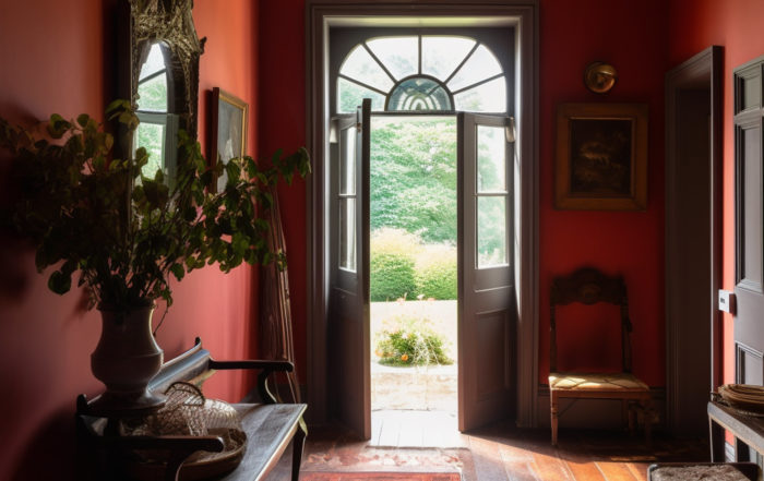
Reds – Choosing red toned interior wall paints
Red, the colour of passion and energy, can make a bold statement on interior walls. Rich burgundy shades can add warmth and depth to living and dining spaces, while brighter reds can inject life and excitement into a room. Use red as a focal point or in moderation to avoid overwhelming the space. Pair with neutral tones or complementary colours, such as soft blues or greens, to create a balanced and harmonious atmosphere.
Read more: The Power of Red: A Comprehensive Guide to Red Wall Paints in Your Home
Whites – Choosing white interior wall paints
White is a classic and timeless choice for interior walls, offering a clean and crisp backdrop for any design style. From pure white to warm ivory, white shades can help to create a sense of space and light, making them ideal for smaller rooms or areas with limited natural light. Use white as a canvas for bold accent colours and artwork, or embrace a minimalist aesthetic by pairing with subtle textures and monochromatic accents.
Read more: The Elegance of White and Off-White Interior Wall Paints: A Comprehensive Guide
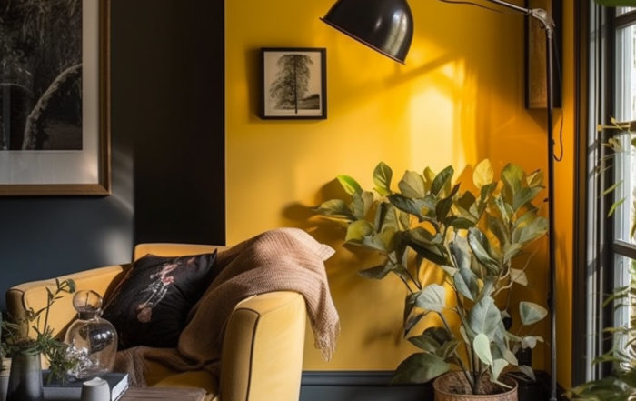
Yellows – Choosing yellow toned interior wall paints
Yellow, the colour of sunshine and happiness, can bring a sense of warmth and cheerfulness to your home’s interior. From soft buttercream to vibrant lemon, yellow shades can brighten up a room and lift the mood. Use lighter yellows in kitchens, bathrooms, or sunrooms to enhance natural light, while deeper golden tones can add warmth to living spaces and bedrooms. Pair with complementary colours, such as blues or purples, for a harmonious and inviting atmosphere.
Read more: Brighten Your Home with Yellow Wall Paints
Selecting the right interior wall paint colour is an important decision that can significantly impact the look and feel of your home. Not just colour, but texture is also important. We also have a range of clay paint colours with equally good eco credentials, but clay paint is even more matt than the normal emulsions, and looks just fantastic. By understanding the characteristics and effects of various colours, you can choose the perfect hue to suit your personal style and create a space that is both beautiful and functional. Whether you opt for a calming blue, a dramatic red, or a timeless neutral, the right colour can transform your home into a sanctuary that reflects your unique taste and personality.
Choosing your natural paint colours
From entertaining to relaxing after work, family movie night to birthday party, the living room is the place where life happens. The right living room colours can lift your mood, inspire you, and reflect your personality, making life that little bit sweeter.
The first step in deciding on your living room colour scheme is to choose a style that matches your home and your taste in furniture, artwork and ornaments. Are your tastes traditional or modern? Do you love a clean, clutter-free room or one packed with eclectic pieces?
Traditional living room colours
If you’re a traditionalist, then subtle, elegant colours are the key. Avoid bold tones and stick to muted, understated shades. Pale blues and greens work brilliantly with white painted furniture, creating a relaxing, airy atmosphere, while yellows and pale pinks look great with natural wooden furniture, and work especially well in rooms with exposed beams and other traditional architectural features.
Remember, going for a traditional look doesn’t mean giving up on creativity. Think of yourself as an artist with history as your palette, and take inspiration from the eras and styles that capture your imagination. Whether you love the rich colours and dark stained wood of Georgian country houses or the sun-bleached creams, reds and pale blues of Victorian seaside chic, let the
Minimalist living rooms and paint colours
Minimalist, white-walled looks used to be thought of as modern, but they’re now a tradition all of their own.
White walls can be beautiful, but if you’re looking for a bolder living room colour scheme, then you can inject a bit of colour into the classic minimalist look with a feature wall painted in a colour which matches your furnishings or artwork.
Modern living room colours
If you’re looking for a contemporary living room colour scheme, the key concept is creativity. Think bold colours not just on the walls, but on the ceiling too. The best modern looks take design and colour cues from furniture, so if you’ve got a stylish contemporary sofa suite or centrepiece coffee table, consider incorporating colours and geometry from your furnishings.
Modern looks allow you to choose bright, unusual colours, so don’t be afraid to be bold.
The key to getting a contemporary look is to think of every aspect of your room as an area to flex your creativity: picture rails, architrave, and structural details like beams and window frames can all be opportunities to try something different.
Colours: Thinking outside the box
Remember, modern doesn’t mean minimal and traditional doesn’t mean doilies. If your home is bursting with eclectic furnishings and accessories, you can still create a striking look. Charcoal grey walls in matt paint make a brilliant backdrop for brightly coloured furniture and artwork, creating space and preventing clashes.
The best way to harmonise eclectic spaces is to find colour schemes which tie the elements together. Pick up shades and tones from your furniture and artwork, and use feature walls to create dramatic backdrops for feature pieces.
Remember, it’s your room
Your choice of living room colour scheme should reflect your personality and make you feel relaxed and inspired in your own space. Take the time to think about how different colours make you feel, and trust your instincts. After all, the living room is the place where your life happens.
Introduction to natural paint colours.
Choosing the right paint for your home can be pretty challenging, especially considering the fact that there is such a huge variety to pick from. Whatever shade you end up choosing is going to have a massive impact on the ambiance of your household, which is why it is one of the crucial parts of any interior designing project. Both the internal and external paint of your household is also going to create a lasting first impression on your visitors and guests as well.
For a lot of people, it can be hard to figure out where to start when it comes to paint colours because they feel like there aren’t many options to choose from when it comes to eco-friendly and natural paints (which is completely incorrect). In this article, we are going to give you some tips for picking out the best paint colours suited for your household and list some of the best options there are for you in the market.
Which colour should I go for?
There is no single answer to this. In the end, it all comes down to what you’re looking for. Here it is important for you to have an idea of the look you’re going for – whether you’re looking for bright and refreshing aesthetics, a soft and subtle look, or a chic design. Below, we have some tips for you if you have at least a general idea of what you’re aiming for.
A chic look – which colours define a chic room look?
If you want your house to give off this elegant and really chic look, neutral colours are the way to go. Not only do they add an air of sophistication to the indoors, but they also make room for experimentation with different colour combinations and styles of furniture and woodwork in the house. When we say neutral colours, we don’t mean those simple shades of beige, white or taupe.
There are a ton of colours and shades to go with. In neutral colours, you have lilac, navy, Etruscan red, mauve, charcoal, and stone, and pink neutrals. When you go with neutral colours, you can elevate their textures even further by choosing glossy or matte finishes, or adding different colour accents to the complement and contrast them. The great thing about neutral colours is that they don’t steal the spotlight either. You can easily add some great quality furniture, cushions and decorations to really amp up the room.
You can go with light neutrals or dark neutrals, depending on the dream room you have in mind. Lighter rooms can instantly make your indoors more roomy and spacious, whereas darker shades can offer that nice feeling of comfort and homeliness without compromising on the posh look. Different tones of rust and mahogany can give this feeling of luxury and earthiness that is delightful to the eyes.
A vibrant and refreshing look – which colours?
If you are looking for a room that feels like a breath of fresh air, then we recommend going for bright and natural colours such as shades of yellow, green, blue and pinks. All of these in their lighter tones are very appealing to aesthetics as these tend to embrace the hues of nature. Because of this, they also have a very soothing and calming effect on the mind and the nerves and can be great for painting rooms where you want to relax and unwind – such as the lounge or bedroom.
Which colours for an exciting and bold look?
When it comes to making a statement with colours, you can really never go wrong with bold colours like gold, purple, blue, red, and their royal and respective tones. They really uplift the aesthetics of the room and can make the room stand out from others. To take the whole look to another level, you can add even bolder accents with colours like black or their darker shades to add depth to the room.
Combining Colours in Your Home
Your guide to help decide the best way to work with colour
Things to Consider Before Selecting a Paint Colour
As with everything, there are a few things you should take into consideration before sealing the deal:
Always be sure to test out the paint on the walls. This will give you a clearer idea of the actual colour and shade which is not always obvious over pictures and other samples swatches.
Consider the amount of natural light entering the room. This will have a direct impact on how your room is going to look in both daylight and dark.
Try to avoid matching your paint colours with your floor, rugs, portraits, and beddings. Get creative and try to contrast and complement with different colours and shades.
While choosing your main colour for a room is important, you will need additional colours in your palette to keep it from getting too mundane. So what sort of colour combinations should you try in order to add that zest you’ve been looking for?
What colours work together to create a modern room, without being overpowering or garish? While the answers vary, we have a few suggestions on colour combinations that will add a chic flair that is guaranteed to raise eyebrows!
The 60-30-10 Rule
Before deciding what colours to choose, it is important to familiarise yourself with this ratio: 60-30-10. This rule of thumb helps to balance out your colour palette and create a harmony in your room.
Your main colour should take up approximate 60% of the room’s space to lay the groundwork for your atmosphere. The recessive colour, which should complement and blend with your main colour, should stay at around 30% so that it does not overrun your base.
Then there is the final accent colour, which will provide that ‘zing’ to your room. It should only take up about 10% in order to keep it stark and bold against the other colours within your scheme.
Now how you combine your colours depends on what mood you are looking for in that room.
The following is a quick list that can help you start to brainstorm the direction you would like to go!
Complementary Combination
This combination includes picking one main colour, for example a deep violet, and then choosing the colour opposite on the colour wheel, in this case a mild to light yellow as the accent colour.
This combination creates a very bold statement that strengthens the power of the colours in the room. Ideal for creating a modern look that isn’t afraid to attract attention, it is imperative to not go overboard with the complimenting colours.
Using the opposing colour as an accent will yield the best results and prevent the colours from competing with one another.
Related colour Combination
This particular combination uses neighbouring colours on the colour wheel. This combination does not have the same dynamic effect as the complementary combination, but instead allows the colours to blend together to create a consistent mood in the room. So following a purple with a blue compounds the relaxing effect of these cool colours. This approach allows for the different colours to be used in a greater volume.
Monochromatic colour Combination
This technique employs the same colour at varying degrees of saturation and tones. This helps to keep the integrity of the colour throughout the room, but also changes it up so that the varying degrees of colour is pleasant to the eye.
Colours psychology & you – How to get the best colour for your home
Taking up a DIY project at home can be exciting, and adding a new coat of paint to any room leaves you with a realm of colourful possibilities! While your options are limitless, there are a few important things to consider when painting your home and choosing just the right colour!
Introducing warm colours to a room such as yellows, oranges, or reds creates a bold, energetic statement. Many people report these colours to be stimulating and to promote a more optimistic atmosphere in places where they’re most prevalent.
While these colours can create an intense environment that catches one’s attention, it has also been noted that prolonged exposure to these colours can make one more susceptible to anxiety or eye fatigue due to the amount of light these hues reflect.
On the other hand, cooler colours such as blues, greens, and purples creates an environment of tranquility and serenity. These colours have been proven to increase concentration and to encourage relaxation when applied to an environment.
Scientifically speaking, exposure to these colours decreases heart rate and body temperature, but also decreases one’s appetite. It is important to note that cooler colours tend to promote depression, lethargy, and even aloofness in some people due to their dark nature.
When dealing with neutral colours, it’s important to note how black and white can transform a room. Black rooms can feel uncomfortable and claustrophobic as it tends to shrink a room, while white rooms feel more spacious and sterile, but can make a room feel unwelcoming.
The effects of these neutral colours can also be applied to the warm and cooler colours discussed earlier. The darker a hue, a more relaxing the colour becomes. Vibrant warm colours can be muted in order to prevent the colour from being too draining, while brightening cool colours can add a little life to a room while maintaining the tranquil atmosphere.
By carefully considering what colours to use, you have the possibility to create the perfect atmosphere in your home!
The Importance of Creating Colour Illusions For Your Home
Choosing what colours fill your home is important. You want to make sure that they produce the exact atmosphere you were attempting to achieve. This can be difficult, given the infinite amount of options one faces when staring at the sheer amount of colours available.
In order to help with this daunting task, it helps to know just how different colours affect the energy of a space. The following painting tips harness the idea of using colour to create an illusion within a room, which can help you control just how the interior of your home ‘feels.’
Using dark and warm colours
The colours you pick have the potential to visually change the size of a room. The use of dark and warm colours will scale down a large room and make it appear cozy, while a small room can be opened up by applying pale, cool colours onto the walls.
Even the visual height of the ceiling can be played with, as painting your ceiling a colour darker than the walls will “lower” it, while painting it a lighter colour will add height. In addition, if you were to paint parallel walls a darker shade than the other set of walls, it will make the room appear elongated. By merely using different shades of colour, you can toy with the entire perception of a room!
Using accent colours to pull together
The use of accent colours can also pull a room together and promote harmony within it. If you want to create a focal point within your room, use a darker or even complementary –depending on how bold of a statement you would like to make—paint only on the wall you would like to focus on.
This automatically guides the human eye to focus on whatever paintings, furniture, or decorum are placed on that side of the room.
By adding light accents to a room, you essentially lighten the patterns and colours of whatever is inside the room. Dark accents will then bring out the darker colours of your living space. By using this to your advantage, you can subtly change the energy your room gives off.
The importance of colour illusions
These colours illusions, once understood, can be harnessed to completely overhaul a room into being something completely different. It adds a fun, new dimension to your interior design that is guaranteed to grab your visitor’s attention – exactly the way you had intended.
What Kind of Natural Paint Colours Are Available To Buy?
Are you getting ready to paint a room or two in your home? If you are sick and tired of looking at plain, boring walls, you may be considering painting them, since it is a lot easier to do than wallpapering. However, you may be dreading painting because you hate the fumes from traditional paints. There is no need to worry because today, you can purchase natural paint, which will work just as well for changing the colour of your walls from drab to fab. Natural paints have so many different benefits and are available in a wide array of colours.
The first thing you may want to know about natural paint is what colours you will be able to find. You may be surprised to know that natural paints come in many different colours.
Using natural paint will prevent you from having to open windows in the same way as chemical paint, so that you do not get overcome by fumes. Natural and eco-friendly paint is also better for the environment, as it prevents toxic waste from being released into the atmosphere. You will see that this paint works just as well as normal paint, but comes without health risks.
If you are getting ready to do some painting inside or outside of your home and you are looking for a great paint to use, consider using one of the mentioned paints to get the job done. You are sure to find a colour you love, and you will be able to paint your home without risking your health.